What Is a Design System and Why It Must Come First
If you're building a product — a platform, an app, a website, or even just a marketing site — and you jump straight into screens and layouts without a design system, you're skipping the blueprint and going straight to hammering nails. That’s risky, expensive, and chaotic.
A design system isn’t just a nice-to-have. It’s the foundation for consistency, speed, scalability, and high-quality user experiences.
Let’s break it down.
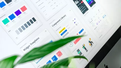
✅ What Is a Design System?
A design system is a collection of reusable components, design tokens, UI patterns, principles, and documentation that help your team build consistent and efficient digital products.
At its core, it includes:
UI components: Buttons, forms, modals, alerts, navigation, etc.
Design tokens: Colors, typography, spacing, shadows, border-radius
Patterns: Layouts, grids, spacing rules, interaction behaviors
Guidelines: Tone of voice, accessibility, brand rules
Documentation: How to use components and patterns correctly
A design system isn’t just a Figma file — it’s a living product that evolves with your brand and team.
🚀 Why It Should Be Done Before Anything Else
1. It Aligns Design and Development from Day One
When designers and developers use the same shared system, there's no guessing, no custom elements, and no duplication. What you design is what gets built.
⏱️ Faster delivery. Less friction. Fewer bugs.
2. It Enables Visual and UX Consistency
Without a system, your product will feel fragmented. Button sizes will vary, spacing will feel off, and users will get lost in inconsistent interactions.
🎯 A design system creates a cohesive experience that builds trust.
3. It Scales With You
As your team grows or new features are added, a design system prevents chaos. New team members can plug into a system rather than reinventing UI elements every time.
🏗️ Think of it as building with Lego, not clay.
4. It Saves Time and Money
Reusability reduces repetitive work. Instead of redesigning or rebuilding components again and again, teams can pull from an existing library.
💰 Less waste, more focus on innovation.
5. It Supports Accessibility from the Start
A good design system bakes in accessibility best practices: color contrast, keyboard navigation, screen reader support. That’s harder to retrofit later.
♿ Inclusive design is easier when it’s part of the foundation.
6. It Future-Proofs Your Product
Need to rebrand or change themes? With a design system, you update tokens (colors, fonts, etc.), and it cascades across all components — saving weeks or even months.
🔁 Adapt without breaking everything.
🎨 What’s the Difference Between a Style Guide and a Design System?
| Feature | Style Guide | Design System |
|---|---|---|
| Colors, Fonts | ✅ Yes | ✅ Yes |
| UI Components | ❌ No | ✅ Yes |
| Interaction Patterns | ❌ No | ✅ Yes |
| Code Libraries | ❌ No | ✅ Yes |
| Documentation | ⚠️ Often Minimal | ✅ Comprehensive |
| Collaboration Tool | ❌ Not Interactive | ✅ Built for Dev & Design |
TL;DR: Style guide = visual; Design system = functional + scalable
🔧 Tools for Building a Design System
Design: Figma, Sketch, Adobe XD
Documentation: Zeroheight, Notion, Storybook
Development: React, Vue, TailwindCSS, CSS-in-JS, Design Tokens
Governance: Git, version control, changelogs, team contributions
Final Thoughts
Don’t skip the design system. If you're serious about building a scalable, user-friendly, efficient digital product, this is where you begin.
It’s not a delay — it’s an acceleration. It prevents inconsistencies, tech debt, and costly redesigns later.
Build the system once. Use it forever. Iterate fast, and deliver better.
- Log in to post comments